
| |


| |||||||
| Discusiones Generales Zona para opinar sobre cualquier tema, espacio de libre expresión y entretenimiento. |
| Hola Invitado! Tómate un minuto para registrarte, es 100% GRATIS y no verás ninguna publicidad! ¿Qué estás esperando?  Para Ingresa a Denunciando.com por medio de TapaTalk Clic ACA Para Ingresa a Denunciando.com por medio de TapaTalk Clic ACA | Registrarse Ahora |
 QUE OPINAS DE LOS DISEÑOS DE LOS BOTONES?? (SUGERENCIAS)Participa en el tema QUE OPINAS DE LOS DISEÑOS DE LOS BOTONES?? (SUGERENCIAS) en el foro Discusiones Generales. |
 Temas Similares
 | ||||
| Tema | Autor | Foro | Respuestas | Último mensaje |
| SUGERENCIAS! | >BATMANbino< | Sugerencias | 18 | 01-08-2009 23:43:45 |
| sugerencias Rockeras | moSkato | Rock | 32 | 23-10-2008 11:42:53 |
| botones peligrosos | Chester | Chistes / Cosas Charras | 10 | 23-11-2007 02:49:37 |
| >>>BOTONES<<< | >BATMANbino< | Discusiones Generales | 14 | 01-03-2006 19:49:10 |
| >>BOTONES << | >BATMANbino< | Discusiones Generales | 65 | 24-02-2006 21:27:53 |
 |
 22-02-2006
, 20:27:09
22-02-2006
, 20:27:09
| #31 | |
| Denunciante Distinguido  | 
Fondo esta Bien Letra no me gusto deberia ser una mas impactante Color de letr oajal pueidra uno escojerla El Logo ojala fuera un poquito mas grande Y pa los gomozos colocarle algo mas aparte de lo q ya tiene Pero en gral estan bien  | |

|  |
 |
Twittear Seguir a @denunciando
|
    | |
 No Calculado No Calculado | #1.5 | |||||||||||||||
| SponSor  |  Re: Re:
| |||||||||||||||
 | ||||||||||||||||
|
22-02-2006
, 23:41:27
| #32 |
| Denunciante Aprendiz  | ESTAN VACANOS PERO AQUI ESTA MI OPINION ADICIONAL: * DEBERIAN SER UN POCO PEQUEÑOS NO MUCHO * LA LETRA DEBERIA SER MAS LLAMATIVA Y QUE MEDIO BORDEE EL LOGO QUE ESTA EN LA PARTE DE ABAJO * Y EL COLOR DE FONDO DEBERA HACER RESALTAR LA LETRA |
|
| |
|
23-02-2006
, 08:59:43
| #33 |
| Denunciante Novato  | YO ESTOY DE ACUERDO CON LO KE DIJO JESS... EL DE URIBE ES EL MAS APROPIADO Y SE VE MUY BN EL FONDO ...ME ES INDIFERENTE PERO SI A ESAS VAMOS... BEBERIA SER NEGRO Y COMO SEA YO LO QUIERO COMPRAR  ... ...SI NO VOY A LA REU LA PELI ME LO COMPRA |
|
| |
|
23-02-2006
, 10:02:53
| #34 |
| Denunciante Mega  |
yo opino.. que estan chimba los botones
|
|
| |
|
23-02-2006
, 10:44:56
| #35 |
| Denunciante Ultra  |
BUENO PUES ESTAN MUY VACANOS LOS BOTONES, PERO EL ESTILO DEL DE LA PE Y URIBE ESTAN MAS VACANOS HAY QUE MIRAR QUE SE DECIDIERA POR UNO DE ESTOS DOS
|
|
| |
|
23-02-2006
, 10:54:14
| #36 |
| Denunciante Distinguido | Dejar el boton como el de uribe pero la letra si la quieren cambiar de color cambiarlo en vez de cambiar el fondo lo mismo el estilo de letra |
|
| |
|
23-02-2006
, 12:09:42
| #37 |
| Usuario Expulsado Denunciante Distinguido  |
ESTAN VACANOS OME!
|
|
| |
|
23-02-2006
, 12:26:31
| #38 |
| Usuario Expulsado Denunciante Ultra  | pues a mi me gustan home...tan muy cheveres!! |
|
| |
|
23-02-2006
, 13:34:00
| #39 |
| Usuario Expulsado Denunciante Distinguido 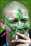 |  MIREN EL MIO  |
|
| |
|
23-02-2006
, 13:43:03
| #40 |
| Denunciante Ultra ![Avatar de [K-MILITO]](https://www.denunciando.com/customavatars/avatar674_7.gif) |
los botrenes estan chimbas pero komo dijo el pòcillo el logo abajo o arriba????????????????
|
|
| |
|

| Etiquetas |
| botones, diseños, opinas, sugerencias |
| |



 Manejese bien pa que lo maten de ultimo
