Parece que Google tomó la idea de ver los thumbnails de manera más grande del buscador BING. Los cambios son basicamente en el formato de los resultados.
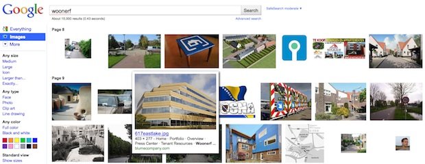
Así se ven los resaultados. Hay un preview de la imagen. El thumbnail crece si pasas el cursos por él.

Y así se ve la imagen dándole click en ella

A mano derecha de la imagen acá arriba pueden ver el link Full-size image para verla completa.
La noticia en inglés Google's Image Search Make-Over Borrows Ideas From Bing
BY
Kit EatonTue Jul 20, 2010
 Google
's Image Search is getting an
experimental user-interface revamp right now, and some of the ideas appear to come from Microsoft's
Bing.
Google has adjusted the site's look so that where there was formerly whitespace, there are now images, the images are bigger, and Google has made descriptive text invisible except upon mouseover.
The page is also longer, with more thumbnails in once place. There's also more use of pop-over windows, and a kind of click-based interface that's similar to how you typically interact with elements on Apple's iPad--a system that's increasingly familiar to PC users.
Google actually tried something similar as an experiment
back in 2007, but retracted it after too many disgruntled folk complained. Evidently Google's decided it's worth trying this again, given that people are now more familiar with the whole process of searching for images. And especially since Microsoft's rival Bing search engine actually has an image search interface that's more polished in terms of looks than Google's.
Why should you care about this change to Google? Partly because any change to the world's dominant search engine will affect how you interact with the Web. And partly because the elements "borrowed" from MS's similar UI mean that Microsoft may have stolen a tiny march on Google for once, and that sort of competition can only be a good thing for consumers.